2022 was a record-breaking year for apps. According to the annual State of Mobile report from Data.ai, new app downloads grew 11% YoY to 255 billion, total hours consuming apps grew 9%, and mobile ad spend grew 14% to $366 billion.
Alongside this growth, subscription-based apps are becoming standard among mobile users. The ten highest-earning apps use this model, where users pay monthly to maintain or upgrade the app’s features and benefits. Unsurprisingly among these are YouTube, Tinder, Disney+, and HBO Max, so it’s clear consumers are willing to pay for and consume their entertainment on a subscription basis.
The expansion of the subscription economy
Today, the subscription economy expands beyond popular streaming services, with companies across all industries using this model to drive new revenue lines.
Meal kit services like HelloFresh simplify families’ weekly food prep, and last year, the delivery app Deliveroo launched a first-to-market unlimited free delivery subscription.
Similarly, the rideshare app Lyft offers a subscription plan where users earn a 15% discount on all trips they take each month, along with other priority benefits.
If your app offers a freemium product or a time-boxed free trial, you likely have one goal: converting those trial users into paid customers. Of course, that’s easier said than done. Asking people for their email address in exchange for a free product is easy, but asking them to pay to continue using it? That’s the hard part.
How can you seamlessly convert your app users from a free trial to a paid subscription? Here we discuss how you can provide an app experience your users are willing to pay for.
Gather data to discover why users don’t convert
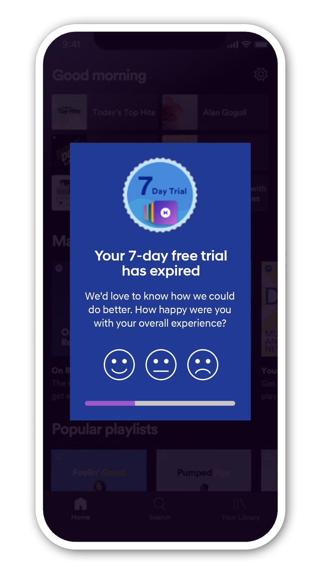
On average, only 25% of free trial users convert into paying customers. Therefore, it’s crucial to determine why your users stay on the free version rather than upgrade to a paid subscription. When a user’s free trial expires and they cancel their subscription, use the opportunity to ask them why they’re leaving.
Trigger a short survey as part of the in-app unsubscribe process to understand what your app might be missing or what features are not compelling enough to justify the cost for users. Once you gather enough data, you can identify why your free trial users fail to convert. You can then use these insights to resolve any recurring issues and improve the app experience.
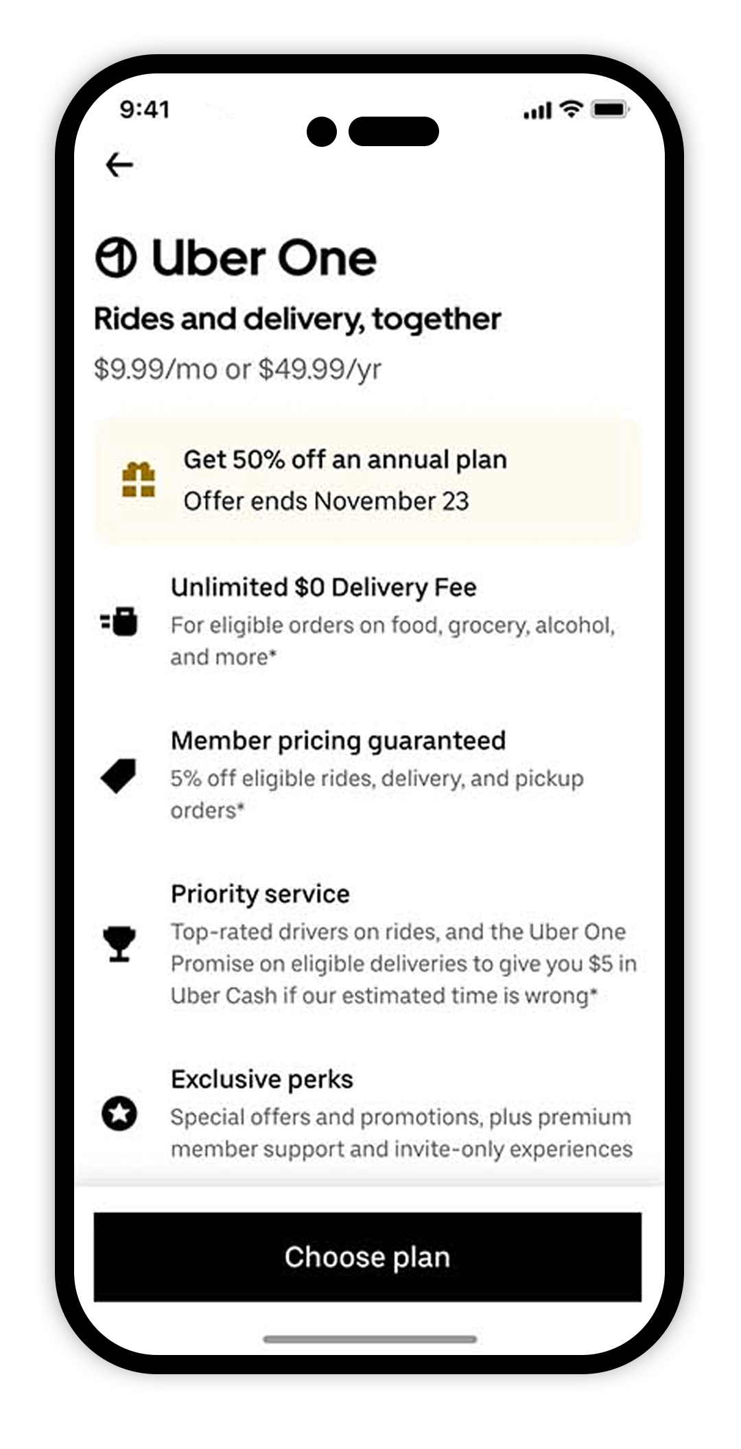
Does your upgrade offer add real value? Take Uber, for example—its Uber One subscription gives frequent users clear monetary rewards every time they order. For $9.99 per month, users get 5% off rides and deliveries, a $5 Uber credit if their delivery is late, and an unlimited $0 delivery fee on deliveries and groceries.
Upgrading to a paid plan can help frequent users save more than continuing as pay-as-you-go customers. By leveraging your data, identify the audience cohorts that would benefit most from upgrading and communicate the savings to them.
If your messaging clearly outlines the added value of upgrading, and you’re communicating this to the right audience, you’ll see much higher conversion rates.
By leveraging your data, identify the audience cohorts that would benefit most from upgrading and communicate the savings to them.
Deliver payment and upgrade prompts
Deciding when to ask users for their payment information during a free trial can significantly impact conversion rates. When a user can sign up without adding their payment details, the average conversion rate is 25%. If a user must first provide a payment method, this increases to 60%.
However, the latter approach could discourage users from signing up, so it’s important to find the model that aligns with your app’s value proposition and user preferences. Of course, excluding a payment method is a more straightforward process for the user and will encourage more initial sign-ups. It’s all about striking a balance between incentivizing users to upgrade and not deterring them from trying your app for free. A/B testing and analyzing user behavior can help you determine the best approach to encourage both free trial sign-ups and conversions to paid subscriptions.
A strategically designed and timed payment prompt can be vital in engaging and converting free users into paying customers. Identify when the user will likely find upgrading useful or enticing and deliver your prompt around these optimal moments.
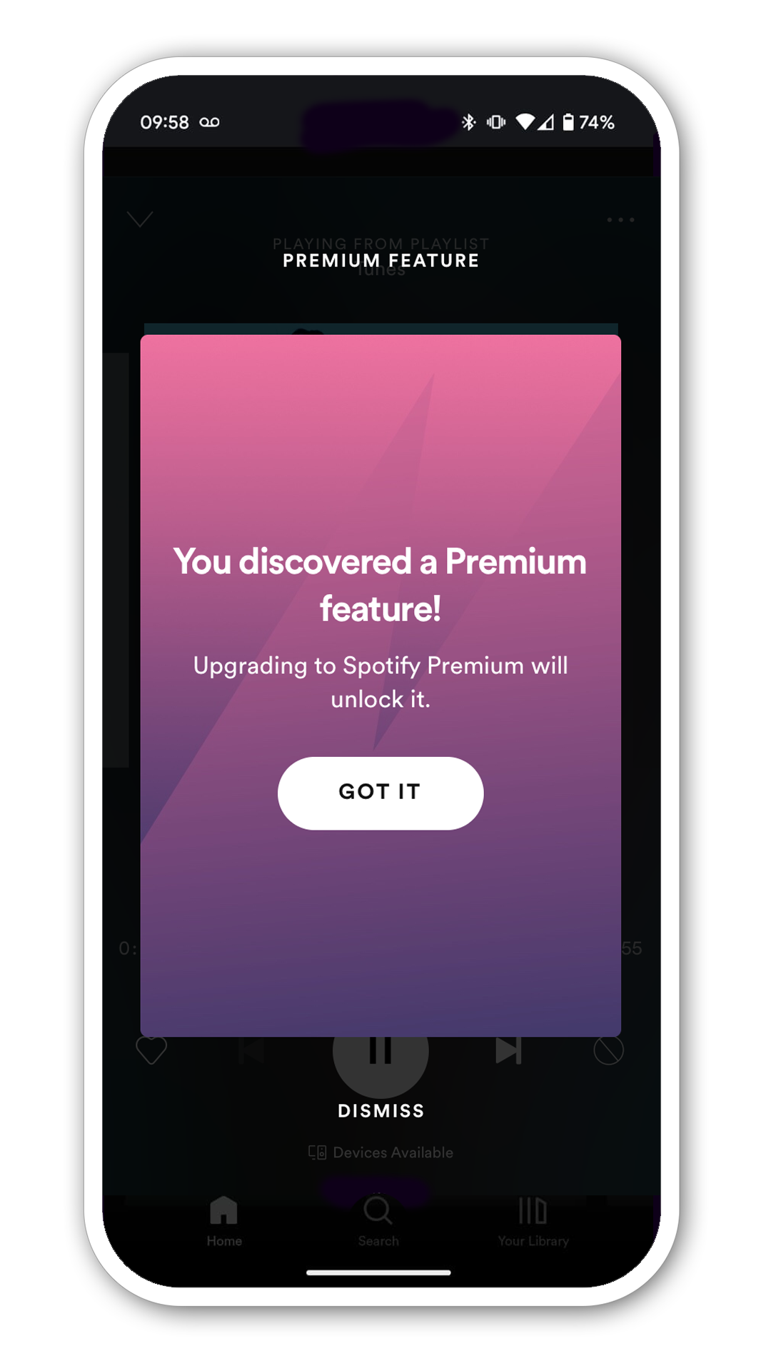
Spotify does this particularly well. The music streaming service offers freemium users six song skips per hour. When they exceed this limit, it prompts users with an in-app message to upgrade to a premium account. Spotify presents the message when it knows the user wants access to a feature only available on the premium version. But rather than the user feeling hindered, Spotify’s messaging creates an opportunity – ‘You discovered a Premium feature. Upgrading to Spotify Premium will unlock it.’
Whether your upgrade prompt is a subtle reminder or a paywall that restricts actions outright, it needs to reach users when it’s most likely to pique their interest. Prompts work best when users feel they are choosing to pay because they enjoy your product and see the value in upgrading—not because you told them to do so.
Provide a stellar onboarding experience
The app onboarding process has become a leading factor in retaining users beyond the trial period. A customer’s first experience following the app install can make the difference between a one-time user and a loyal subscriber, so it’s worth spending time optimizing this journey.
Is it clear early on how your app solves your users’ pain points? Many apps struggle to communicate their core value proposition during onboarding which often leads to high user churn and abandoned registration. To avoid this, demonstrate value from the start by gradually guiding users through the app’s key features and benefits. This will set the foundation for a positive and long-lasting relationship.
A clever move by the language learning platform Duolingo allows users to try the app before committing to entering their details and creating an account.

By beginning the experience with a core product feature, users immediately understand the app’s value and are already engaged when registering.
When customers experience firsthand how your app solves a pain point, it’s easier for them to imagine how paid features will enhance the experience.
Subscription optimization with MessageGears
If you’re successfully encouraging people to sign up for a free trial of your app, your marketing efforts are paying off. However, persuading trial users to stick around and become paying customers is where the revenue lies.
This is where MessageGears can help. With expert marketing and technical teams, we help brands create dynamic campaigns that onboard, retain, convert, and monetize for faster growth and higher customer lifetime value (CLV).
Learn more about turning your trial users into paying customers.

Sarah Kelly
Sarah is a passionate marketing professional devoted to crafting thought-provoking content that fuels business growth and success. With over a decade of experience in the ever-evolving marketing world, she brings a strategic and data-driven mindset to her role as SEO.