Found 261 Results for "mobile"
Product release: Enhanced mobile features for a superior cross-channel experience
The past few years haven’t been easy for large B2C brands. Grappling with rising customer acquisition costs and a more cautious consumer spending mindset, marketing teams in part ...
MessageGears extends direct data access to its enhanced mobile push solution
MessageGears redefines cross-channel engagement for enterprise consumer brands ATLANTA, GEORGIA (MARCH 7, 2024) — MessageGears, the leading cross-channel engagement platform for ...

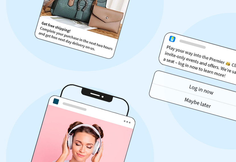
Increase mobile app engagement with these strategies
Key Takeaways
- Targeted, thoughtful in-app messaging can deepen engagement and drive product adoption.
- Make sure to step back from your product and take the time to understa ...

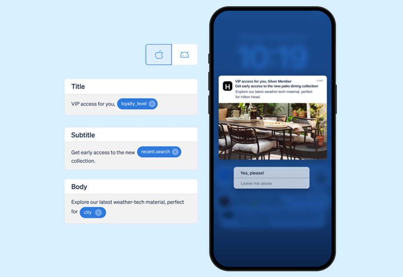
6 ways to take your mobile app personalization beyond first name
In the fast-paced world of mobile apps, customer expectations around personalized experiences are reaching new heights. Recent research reveals a whopping 73% of customers expect b ...
Three UK Increases Revenue by 79% With Real-Time Mobile Messaging
Mobile app onboarding: Creating engaged users from the start
An optimized app onboarding process is crucial for engaging users and ensuring they remain active over time. When users fail to grasp the value of an app from very early on, there� ...

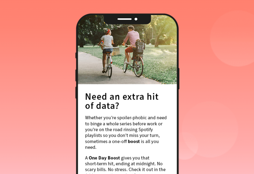
Best ways to reduce your mobile app churn rate
In today’s highly competitive market, mobile apps are investing heavily in acquiring new users, meaning churn is more costly than ever before. It’s a harsh reality that every a ...
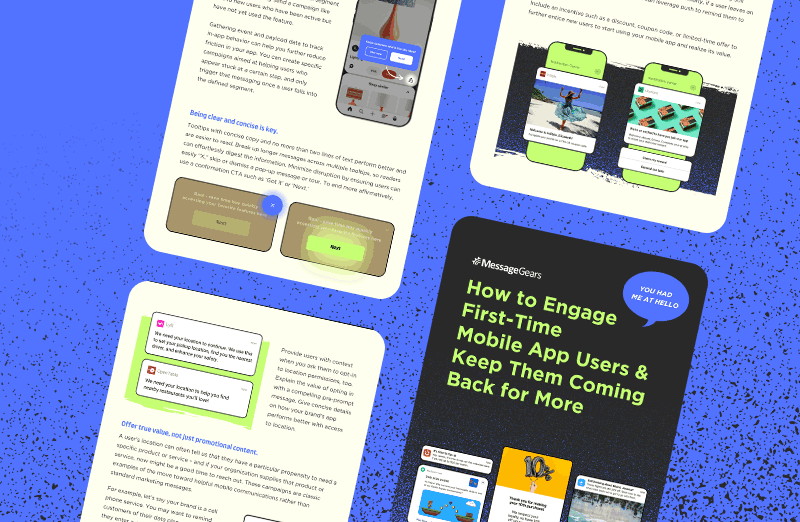
Engaging First-Time Mobile App Users

How to use tooltips on mobile to enhance the app experience
When it comes to creating a seamless user experience for your mobile app, even the most basic tooltips can make a significant difference. When done right, they elegantly guide user ...
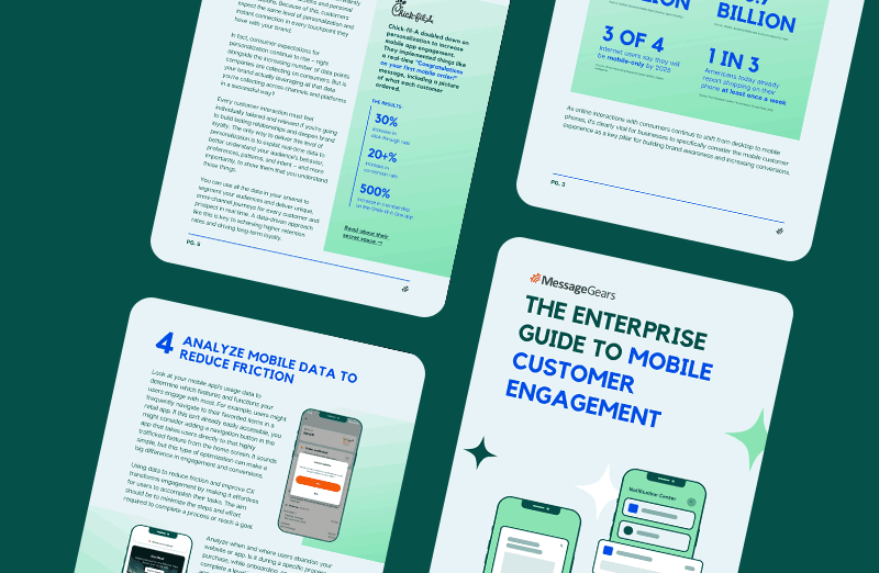
The Enterprise Guide to Mobile Customer Engagement