In 2021, the world adapted to an ongoing pandemic. Working styles changed, industries shifted, and consumers doubled down on their mobile-first habits. In this new normal, mobile apps helped deliver powerful content and transformative experiences to enrich users’ lives worldwide in more ways than ever before. Fast forward to 2024, and the changes sparked by the pandemic are still very much in play, with the mobile app industry continuing to thrive. In 2023, consumer spending, downloads, mobile app engagement, and time spent in apps all soared to new levels.
Time spent on mobile increases
Across the top 10 markets analyzed, the average time spent on mobile surpassed five hours per day in 2023—up 6% from 2022—to reach a new high. That’s an additional four countries spending more than five hours on mobile compared to 2022.
The average American spent an hour less (3.1 hours) watching TV than they did staring at their mobile screens. This is an increase of 30% since 2019 and equates to a third of waking hours consuming mobile content.
App download and revenue growth
Consumer spend outside of mobile gaming has skyrocketed over the past 10 years, climbing from less than $3 billion in 2014 to $64 billion in 2023. The Entertainment, Social Media and Utility & Productivity categories led the way for growth in 2023 as every single genre grew YoY.
219 apps and games generated over $100 million in annual consumer spend, and 13 exceeded $1 billion. To put this in perspective, only 47 movies achieved this milestone in global box office takings during the same period.
This dramatic shift gives us insight into the long-term change happening in consumer habits as they migrate to mobile as their de facto gaming console, entertainment hub, and universal tool for managing their lives.
How is this growth impacting marketers?
The data from 2023 is helping global brands discover opportunities for reaching audiences where they are—and we know that place is on mobile. The surge in app usage, downloads, and spending highlights the demand for marketers to create experiences that engage customers on mobile.
The results from last year suggest an entirely promising landscape for app developers and marketers, right? How could they be interpreted as anything but optimistic? But before coming to conclusions, we should air on the side of caution and analyze the data a little closer.
Yes, users are shifting their attention from non-mobile activities to apps. But not just any apps. They’re spending 70% of their time in social, communications, photo, and video apps—namely TikTok, Instagram, and Facebook.
TikTok, in particular, stands out as the most popular social app globally, with over 770 million downloads in 2023. It has become one of the most popular social media applications of all time. But why is it so popular, and what can we learn from its explosive growth?
TikTok’s unique algorithm learns what content users want faster than any other app of its kind, resulting in highly relevant user experiences. According to a Neilsen study, users are looking for micro-entertainment and short distractions during the day, and TikTok delivers just that through its sophisticated algorithms presenting users with content that resonates with their interests.
What can non-social apps learn from TikTok?
TikTok’s widespread popularity gives us a glimpse into what it means to be living in today’s hyper-connected world. Users spend so much of their waking hours in these social apps because they want to feel connected, and know the content they encounter will be vibrant, interactive, engaging, and relatable.
Over time, they’ve come to expect the same level of stimulation they get from short-form video content (the majority of TikTok clips clock in at just 15 seconds) from all their mobile experiences.
Increasing mobile app engagement in a crowded landscape
These findings present new challenges for mobile apps: breaking through the noise of a crowded mobile landscape. How can you replicate the connectedness and engagement users enjoy in social apps across other categories?
Finding new and creative ways to relate and engage with customers has never been more critical. As users leave social apps to spend the remaining 30% of their in-app time in other categories, how can brands make every moment count?
Educate users on the value of your app
When your marketing efforts successfully lead users to download and open your app, it’s prime time to engage and provide value. This is your chance to take control of the user experience and offer meaningful content at strategic moments. A perfect way to achieve this is through in-app messaging. An in-app message works by presenting on a user’s screen while they are interacting with the app. The message appears in response to their past or real-time behavior, providing relevant information or guidance triggered by specific events within the app.
This unique channel offers unmatched engagement and can be applied to a multitude of use cases to provide ongoing value to users.
Feature discovery
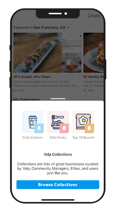
Think of a scenario where a user hasn’t discovered a core feature or functionality after five app sessions. An in-app message can serve as a guide, directing them to the feature’s location or offering insights into why it’s worth exploring. Yelp does a good job of this with its “Yelp Collections” feature, highlighting what makes the app stand out.
In-app tooltips
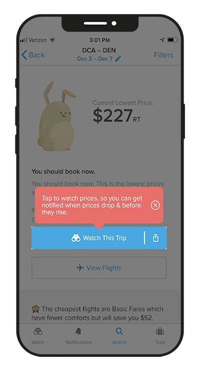
Help users get the most out of your app by offering bite-sized tips throughout the app. If certain features are flying under the radar, or users haven’t uncovered their full potential, customize your messages to highlight these features and trigger them at moments where they would be most beneficial. By doing so, you’re not just showcasing the app’s functionality; you’re guiding users to unlock its full potential.
Travel booking platform Hopper uses in-app messaging to turn simple actions into pivotal aha moments. In this example, they highlight the advantage of the feature by helping users visualize the maximum savings they can make by using their platform.
Feature education and awareness
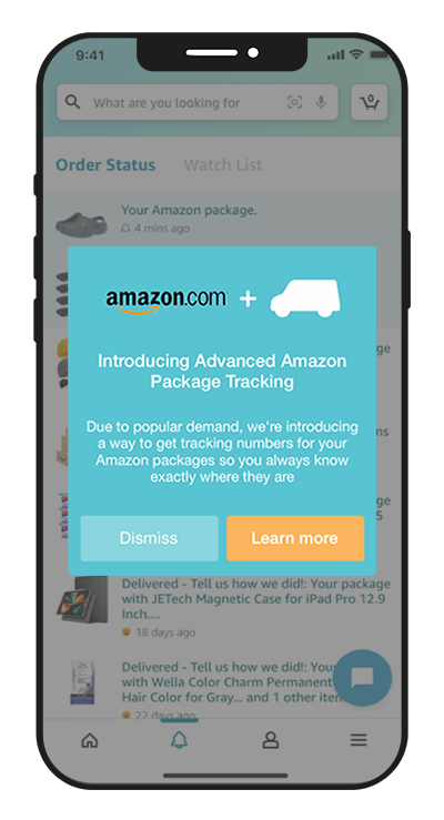
When you roll out a new feature, you can let your audience know about it the moment they launch the app, just as Amazon does here. This subtly communicates that you’re consistently enhancing and adding new features to improve the user experience. It’s a straightforward yet effective way to showcase your commitment to innovation and keep users engaged with the latest features.
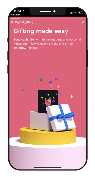
The banking app Revolut offers a wide range of features, meaning some functionalities go unnoticed, tucked away from the main dashboard. This is particularly true for users who have built habits around banking or when certain features deviate from traditional banking scenarios.
The richness of Revolut’s offerings could easily be overlooked if not brought to the forefront with thoughtful and engaging in-app messaging campaigns.
To build deep, lasting app engagement across the user journey, provide guidance that empowers users to uncover the long-term value of your app. Motivate them to take meaningful actions with in-app messages that are designed and positioned to inform and delight users every time they enter your app.
Provide helpful progress updates
The ultimate challenge for making an app engaging? Bookkeeping software. 🤯 If an app can make you feel good about doing your taxes, it must be doing something right.
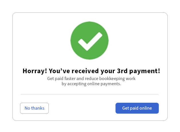
Quickbooks makes payments more interesting by communicating milestones with friendly in-app messages. Regardless of mundane tasks, these celebratory messages serve as mile markers and give users a sense of progress and satisfaction. Identify any tedious tasks associated with your app and break them down into more manageable stages. By celebrating progress and giving users a clear indication of where they are in a lengthy process, you can both simplify workloads and create a more rewarding experience. When users associate your product with making their lives easier and more enjoyable, they’re much more likely to stick around.
Learning a new language can also seem like a daunting task with no end in sight. Duolingo encourages users with milestone achievements and uplifting message copy that encourages regular learning and repeat usage of their app.
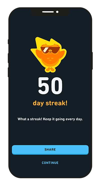
What behaviors do you want your users to repeat? Use in-app notifications to highlight milestones and encourage positive habit formation.
Showcase content, products, and offers
Every time a user opens your app, they carry out a number of potential actions—from browsing content and clicking links to making purchases. This information helps you understand how each user is interacting with your brand and creates opportunities for trigger campaigns.
Crafting logical and valuable messages tailored to a user’s specific actions can deepen customer engagement and lengthen the time they spend in your app. Personalized messages based on in-app behavior resonate with users and keep them coming back.
A media app, for example, recognizes a particular user always clicks through to read articles about Formula 1 racing. When they open the app, sending an in-app message directing them to a breaking news story about Lewis Hamilton adds a layer of personalization that captures their interest and keeps them engaged.
A streaming app can notify users of new episodes, seasons, or movies and suggest fresh content based on what they’ve previously watched.
An eCommerce store can leverage app data by offering enticing discounts on wishlist items, sharing offers on previously viewed products, and recommending complimentary items based on the customer’s recent purchase history. This strategic use of app data enhances the overall shopping experience and encourages customer engagement.
Connect with your mobile app users
Targeted, thoughtful in-app messaging can deepen engagement and drive product adoption. A barrage of generic popups, on the other hand, tends to have the opposite effect, driving people away. For brands to truly connect with their customers, they need to take the time to understand them—identify who needs what and when, and then target messaging to the people who will find it most useful in that moment.
As customers face more distractions on their mobile devices than ever before, personalization and relevance have become non-negotiable. Brands can’t afford to ignore the increased demand for 1:1 communications and should take advantage of the technologies shaping the future of mobile marketing.
Read more:


